State of Obesity
Interactive Data Visualization
Power in
Numbers

There’s an important story in the data. We helped tell that story visually, through a narrative user experience.
The Problem
When the State of Obesity campaign* communicates with policy influencers and medical professionals, they need their story to be clear, compelling, and accurate.
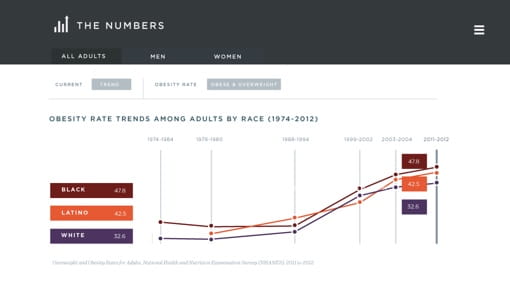
We needed to create a long-form data visualization experience that showed the user the Big Picture, while giving them controls that let them dive deeper, to focus on the states, gender, or racial/ethnic segments most important to them.
The Solution
In State of Obesity’s state-level and special reports, we made the data simple enough to understand at-a-glance, but with detailed controls that let the user easily find what they want to see.

Testimonial
Brave helped make it easy and intuitive for the user to browse and understand a lot of state and demographic data on State of Obesity, and we couldn’t be happier with the results.
Jeff Stanger
Director, Center for Digital Information